![WORK LIST[DETAILS]](/contents/works/design/images/left_title.gif)


Les 24 Chevaliers Part XIII: Idumi Hirose (Color Setting)
Deciding the colors for an animated TV series is not as easy at it seems. In this 13th interview, we asked Le Chevalier D'Eon color coordinator Idumi Hirose, aka Hokki, to tell us how she managed with this delicate task, that requires artistic sensibility as well as coordination with the whole staff.
Part XIII
Idumi Hirose's In principio erat Verbum: "Imagination"!
| Idumi Hirose Color designer. Born in 1977, she created the colors for many well-known I.G titles, such as Dead Leaves, Innocence, Otogi Zoshi, xxxHOLiC, Blood+ Third Opening and Asience: Hairy Tale. Nickname: Hokki. |
What was your impression when you first heard about this project?
I thought it would be fun since I'd never worked on a period drama before. And the story was going to take place in France, so I had imagined that it was going to be a very elegant and stylish anime. I was thrilled.
Is there any color treatment that is specific to Le Chevalier D'Eon?
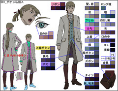
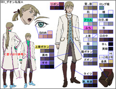
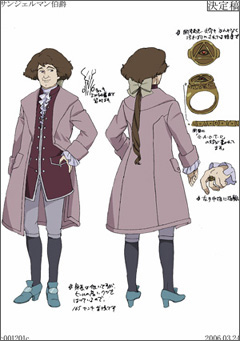
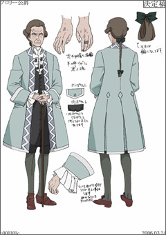
The location and time change a lot, so we sometimes have to make 20 to 30 different sets of color schemes per character in each episode.
the location and time of each scene.
I also had a request from the director to use the "color trace" method for coloring lace-trimmed dresses of aristocratic women. We usually use black solid lines to draw the outlines, but this "color trace" method required us to use a different color to trace the outline of the frills. This inevitably increased the number of colors used, so it became extra work for our painters.
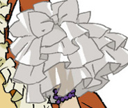
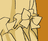
In other works I would naturally tend to use flashy colors as well, but this time, I took into account the fabric that was used in those days. The color tone of outfits changed drastically through various periods in history. Now, we also have clothes made of satin and cotton, but in those days, aristocrats wore silk. It was difficult, because I wanted to confer a sense of worn out heaviness, but at the same time, maintain the gorgeous look that you would expect from the nobility of that time. My objective for this project was to make the outfits look as if you can feel the quality and texture.
How did you actually decide the color schemes?
First, I checked with the director about which characters appeared together often and then I selected colors for each character so that they would balance. The background was also important. If a character often appears in a green background such as a forest, then I avoid using greenish colors as the main color for this character. Take another example such as King Louis XV, who usually appears in his extravagant office; his garment would be more visible if it was in simple colors. These are the things I'd take note when coordinating colors.
I also categorized the color schemes according to the characters' personality traits. For instance, a Poet would be in black and villainish characters are in cold colors. I also have to know the story of each character. For example, if a dying character is to come back to life later or the two characters are actually the same person, then I should know in advance. If I find about these later, then I end up thinking, "I'd have done something different" and lament about it. (lol)
How did you actually communicate with the director?
First of all, I made a number of color scheme samples and asked Furuhashi-san to choose. I cleverly showed him my favorite one at the end. (lol) No, actually, the final decision is the director's. He decides on the basis of personality of the characters and other various factors, so I tried to convince the director by explaining, "this character often appears with that other character, so I think this color scheme goes better."
You mean you'd actually discuss the color images of the characters with the director?
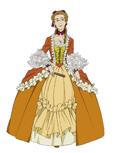
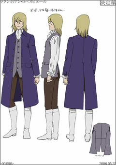
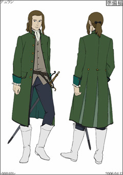
The director would request quite persistently to tone down Marie's colors, so I used beige. As for Madame de Pompadour, he said "definitely vivid," so I chose orange. There was another request to make Maximilien blonde. I think the broadcaster had an intention to make him the star character. Other than these, they let me decide. Even then, I asked about the story development and the relationship between the characters. Let me give you an example: Durand and Maximilien both wear white boots. I decided to do this because I heard from the director that Durand used to have strong admiration for Maximilien.
Working as a color coordinator, which character did you come to like the most?
The Count of Saint-Germain and the Duke of Broglie. I was able to realize the color schemes I always wanted to try. I loved both the minute I completed them. The director OK'd it the first time too. Their morning and night variations were made to keep to their main color schemes too.
How long does it take to complete a color scheme for one character?
I do the entire coloring and then check it the next day, so it takes at least two days. The more time I have, the more I'd be mulling over it. If I don't have time, I can make decisions quickly. So it doesn't mean it's better to spend more time. Of course I spend only two days actually working hands-on, but I think the time I spend pondering and thinking of the images is important after I get the line drawings from the character designer.
Does the character design have a lot of influence on the image of the character?
I can sometimes feel the designer's intentions. For instance, Madame de Pompadour. The lines were so meticulously detailed that it allowed a lot of segments to be colored. That meant we could allocate different colors - each frill could be in a different color even. So you can see that this character is meant to be particularly sumptuous. The first scene we did was in front of the foliage in the palace garden. It came to me that citrus colors would stand out. It's easy to say citrus colors, but the impression differs by where you put oranges and yellows. I get more imaginative with this type of work. I had more difficulty with simple characters.
What do you enjoy about working on Le Chevalier D'Eon?
The fact that I have no original to refer to. It's a different situation from an anime adaptation of a manga where you closely reproduce the original. The only colored original I received was Kiriko Yumeji (*)'s illustration of a dress for D'Eon/Lia. It was fun to use my imagination and I learned a lot. It also made me realize I needed to study more.
How do you train yourself in the art of color designation?
I would say observation. You see, I tend to overlook a lot of things in my daily life. So when I get a scene to work on, I sometimes have to contemplate, "what's the color of ink?" or "when we scoop up water in hands, how does the color of the water change?" In these cases, I simulate the scenes as much as I can.
And also, I sometimes fake rather than reproduce true to the real color. For instance, a piece of meat would look more appetizing if I use a brighter tone. You can say your work will show how you see things everyday. In Le Chevalier D'Eon, I tried to design and devise color schemes using my own experience.
Lastly, please leave a message for the viewers.
I think there is no other anime made here in Japan that really takes XVIII century France as seriously as this one. (lol) I hope you will tune in.
(*) Kiriko Yumeji is the artist in charge of the manga version of Le Chevalier D'Eon.
© Tow Ubukata · Production I.G/Project Chevalier 2006

 terms of use