![WORK LIST[DETAILS]](/contents/works/design/images/left_title.gif)


Making of Blood+ OP 3 - Part 2: Colors and Background Art
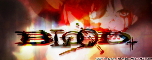
TV series Blood+ eventually featured 4 different opening films, directed by different creators with totally different graphic styles. All films have a slight twist to the ordinary, but the third version, seen from episode 26, somehow stands on its own. This unusual film of just 90 seconds, that was recently selected in competition for the 11th Holland Film Festival, obviously has an interesting production story behind it. So we have asked the staff to tell us more about their work. This second part of our exclusive interview is focusing on colors and background art.
Staff Profiles
Naoyoshi Shiotani
Sequence and animation director. Born in 1977, he's one of Production I.G's most promising young creators. His main works include Windy Tales (2004) and Blood+ (2006), and served as key animator in a number of I.G works, such as Otogi Zoshi (2004), The Prince of Tennis - Two Samurai: The First Game (2005) and Tsubasa Chronicle - The Princess of the Birdcage Kingdom (2005). He's a soft-spoken nice guy with a naughty boy inside.
Idumi Hirose
Color designer. Born in 1977, she created the colors for many well-known I.G titles, such as Dead Leaves, Innocence, Otogi Zoshi, xxxHOLiC and Le Chevalier D'Eon. Widely reputed Production I.G's super idol (as she would promptly confirm if asked). Nickname: Hokki.
Matty
Production assistant of undisclosed age. Before Blood+ he previously worked in Windy Tales. His trademark glasses and his distinctive humbleness made him a popular character. According to unconfirmed I.G in-house legends, last year he received the most Valentine chocolates in the entire studio, even outnumbering celebrated veteran animators. His recently adopted refreshing shaved head apparently improved his popularity.
We can notice a unique approach to characters and colors. It is as if the characters, otherwise the main component in an opening film, have a sort of secondary role.
Matty: This time, I think we aimed to make the entire scene interesting rather than focusing on the characters.
Shiotani: What I had in mind was the movie, Amelie, by Jean-Pierre Jeunet. Just like in the movie, I wanted one particular color to catch the viewer's eye in every single scene. Since Production I.G has top creators in every section, including color setting, in-between animation checking (NOTE: responsible for unifying the style of pencil lines), coloring, and filming, I aimed to bring out the skills of each section not only in the movements of characters, but also in the entire scene. In order to do so, I decided to use a type of digital paint software called Animo, which would liven up the lines.
Hirose: At Production I.G we basically work with two kinds of paint software: Retas and Animo. Actually, I experimentally scanned the lines with both and compared the two, and then asked Shiotani-san to explain to everyone about the necessity of using Animo. This software takes more time for scanning and coloring compared to Retas, but we dared to take the challenge by using Animo in order to keep our style. I.G is probably the only production house in Japan that still uses Animo. When we work with Retas, data are converted into dots, but with Animo, we can render grayscale soft rhythmic lines.
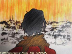
Shiotani: We were able to visually render what we initially had in mind. I think it was important that we could invite Kobayashi Production (*) to do the background for us. I worked with them in the production of Windy Tales as an animation supervisor. I thought we really needed Shichiro Kobayashi-san's talent and experience so that the audience would be able to picture the story with characters actually "existing" in a particular scene.
Matty: We thought we couldn't just use the computer-generated background. That would not really match that profound texture we aimed at. When we sent the storyboards to Kobayashi Production, Kobayashi-san really loved them. We were so excited that our meeting went on for four hours.
What did you discuss for four hours?
Hirose: We started by selecting the drawing material...
Matty: The minute he saw the storyboards, Kobayashi-san said, "this will not be an ordinary background." When we discussed the cels (**), an idea popped up in Kobayashi-san's head to use dermatographs, which are sort of like a cross between crayons and colored pencils. He immediately drew entire scenes right on the spot.
Hirose: He took out transparent cels that we used years ago and burst forth into drawing. I was simply astonished: who on earth would use cels today?
Shiotani: The first color coating of the background is usually done with paint. He'd put a cel over it; and believe it or not, he went on to use both sides of this cel.
What do you mean by "both sides"?
Shiotani: Basically, the lines drawn on the surface and on the other side do not have the same feel or the texture. He utilizes that difference very well.
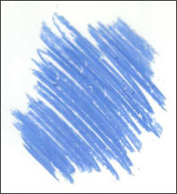
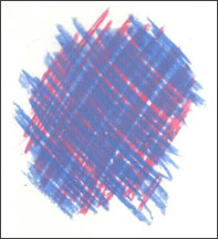
By drawing on both faces of the cel, the colors do not get mixed, obtaining a distinctive flavour.
Hirose: He told us that he then shaved and rubbed the surface to create different textures. I knew Shiotani-san liked my photo album of Friedensreich Hundertwasser's architectural designs, so I was wondering if I could use Hundertwasser's color patterns for tiles in the bath scene. I brought the album to Kobayashi-san to use it as a reference.
Shiotani: I think he grasped the ideas well to render them onto the screen. Using Kobayashi-san's finished background, I determined the colors for characters in each scene with Hirose-san. That way we could balance the colors of the entire scene accordingly, which I really appreciated. As I said in the beginning, I boldly made the characters appear black like shadows so that they won't offset the strong effect of the background. I feel they blended in well.
Matty: It looks as if we'd shaded off the background. But this effect is not obtained by digital processing. We actually blurred the lines that were drawn with the dermatographs using rubbers. Kobayashi-san later told me that the footage had a sort of "tangible sensation" to it.
(*) Kobayashi Production is an animation background art atelier founded by Shichiro Kobayashi (Hokkaido, 1932), one of the most respected veterans in the Japanese animation world. His credits include Lupin III: Castle of Cagliostro, Urusei Yatsura 2: Beautiful Dreamer, Berserk, Utena and many others. For Production I.G he contributed as art director for Otogi Zoshi and Windy Tales.
(**) "Cel" is the current term indicating transparent celluloid sheets, used in animation before the advent of the digital era. The last production made with cels at I.G was Jin-Roh, in 1999.
(2 - continues)

 terms of use